
Project Overview
Housinomics
Housinomics is a UI-focused real estate research app for first-time real estate investors. The project brief included user research, a persona, and broad project guidelines. I came in as a UI designer tasked with creating the mobile app and designing select screens for the tablet and desktop platforms over 2 months.
The Team
Me, myself and I
My Role
UI Designer & User Researcher responsible for;
Competitive Analysis
Background Research
Wireframing and Prototyping
Icon Creation
User Testing
The Problem
Real Estate investment is complicated, and first-time buyers and renters need an app that will give them the information and expertise necessary to enter the real estate investment world in an educated way.
The Opportunity
To create a real estate app that focuses on the market research and due diligence aspect of real estate investment. Gives investors a tool to learn real estate and invest in the right property.
Final Deliverable
Housinomics allows first-time real estate investors to;
Perform market research on various statistics within the area of their choice
Learn more about real estate investing through blogs and articles
View, save, and book tours of properties
Get in touch with local contractors to perform due diligence review of properties before buying

Meet Rashida….
The user persona was given in the project brief. To start the project off it was just a matter of analyzing it and getting insight.

Rashida Is…
Financially driven, the property is an investment, not a new home
A first-time investor and wishes to educate herself
On the go and needs to use her time efficiently using a straight-forward app
The App Must Be…
Educational
Easy to Use
Comprehensive in its features
Understanding the Existing App Market
With the user persona established, I conducted a competitive analysis of existing real estate investment apps to understand how they worked, their strengths, and their weaknesses.
Apps Reviewed

Realtor.com

Zillow

Redfin

Trulia
Takeaways
Neighborhood Summaries, and Residents Polls- give potential buyers a more complete picture of the property's surrounding area
Property Amenities Listed with Iconography (ie. heating, cooling, parking, etc.) - gives most important property information in one place
Map View and List Views of properties and being able to switch between the two seamlessly
The "Check Availability" button - decreases the number of steps to contact the property manager or schedule a tour
Real Estate Deep Dive
With the goals of the given persona in mind, I needed to better understand the real estate investment process and how my app could be a tool within that process. I used several different sources including;
Youtube videos
Podcasts - B.R.E.D. (Black Real Estate Digest), The Ramsey Show
Websites - ListSource, Yieldpro, Berkadia, etc.
This research gave me topics to focus on and inspiration for the app's presentation. I decided to focus the app on the 2 middle steps in the real estate process; Market Research and Closing Deals.
Making the Research Tangible
Using information gathered from the competitive analysis, I was able to create task flows for the basic features within the app.
The flows themselves required minimal ideation because all of these features were standard in real estate investment apps.

Low Fidelity Design
I started the design process by rapid prototyping the mobile screens to flesh out the task flows I previously diagramed.
It was important for the page layouts to show a natural progression of the primary and secondary tasks as you move from top to bottom of the screen.

The design needed to be straightforward and use familiar design patterns. Material Design patterns were also implemented


Low Fidelity Screens


Path to the Final Design
-
The initial iterations focused on;
Keeping design simple due to the vast amount of elements on a page
Using thinner lines to allow for more white space
Reusing icons as necessary, to make info comprehension easier
Providing clarity through color contrast
-
To further differentiate this app from existing real estate I wanted to focus on market research and closing the deal phases of real estate investment. I conducted a "how might we" exercise asking questions such as;
How might we help the user complete market research?
How might we educate the user on the real estate investment process?
How might we help the user complete due diligence on their property of choice?
-
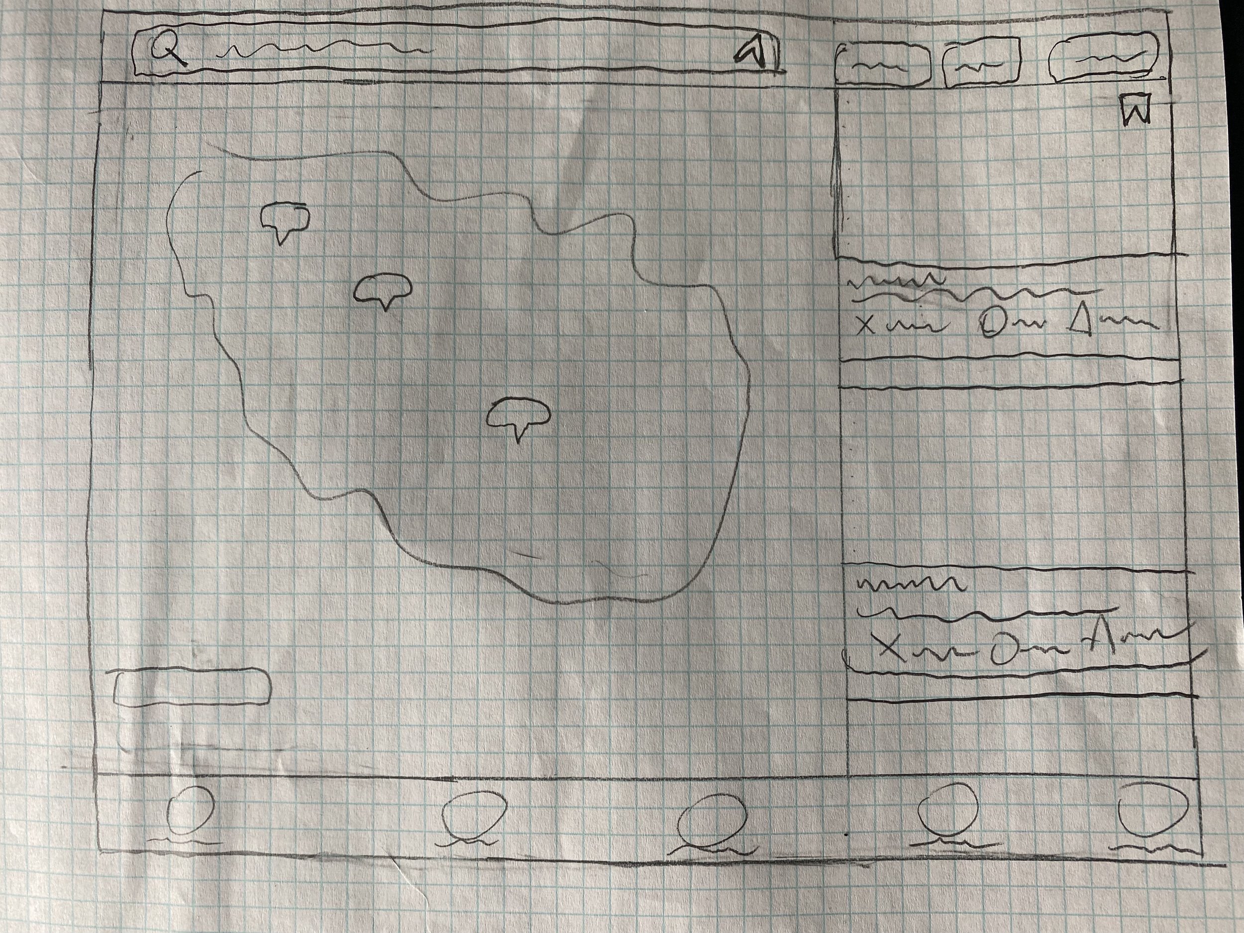
The most important new feature yielded from the how might we exercise was the neighborhood overlays that allowed users to quickly understand the surrounding housing market. Through additional research, it was revealed that crime statistics, local amenities, new construction, schools, and population statistics, were some of the most important factors in market research for new buyers and renters.
Neighborhood Overlays

High Fidelity Screens

Style Points
The style guide was created to organize the various UI elements. The Full style guide can be seen here Colors typography and iconography can be seen below. A set of icons was created from scratch to provide symbols to accompany the vast amount of real estate information.
Created Icons

Typography

Colors

Iconography

Establishing Other Break Points
With a style guide in place, it was time to transfer a few of the primary screens to Surface Pro Tablet and a Surface Book Laptop, breakpoints.
First, I reviewed several commonplace apps on all three platforms
Examined the previously reviewed real estate apps on all three platforms, looking at page layouts and interactions across platforms.
Desktop


Tablet

The Final Touches
To gain insight into how the app actually functioned, I conducted three user tests with people familiar with real estate apps. The participants were asked about their general experiences with real estate apps and then given four scenario tasks to complete within the mobile app.
Each user gave their opinion of how satisfied they were with the ease of completing each task and the time it took to complete each task from 1 not satisfied to 7 strongly satisfied (Average score of 6.3).

User Testing Results
The biggest issue that affected how the app functioned was the lack of user onboarding and the progression of the onboarding screens. Due to the lack of a true onboarding flow, the testing participants did not know the full capabilities of the app or where to find certain app features.
Onboarding Fixes;
Place the housing filters page before the property listing page so user can choose their preferences from the outset.
Include coach marks onboarding to inform the user of the function of the app (see below)
Reflection
I did not focus the app on the first iteration and took me longer to get through iterations than was necessary. In the future, I will not sweat every last detail but instead iterate, test and peer review the design more often. Beyond that, I was able to simplify complex information through the subtle changes.